整合了两因素重复测量方差分析及均值误差折线图所用代码
所用r包: broom、data.table、Rmisc
汇总结果表
注:日常工作中常遇到需要整理重复测量方差分析表,该表需结合t检验、单因素方差分析及单组及两因素重复测量方差分析,若分步骤处理较为麻烦,因而我整理了一个自定义函数可快速生成该表格
自定义函数
library(tidyverse) #数据处理
library(broom) #整理方差分析结果
library(data.table) #数据合并

perform_analysis <- function(data, treatment_col, time_cols) {
  data[[treatment_col]] <- as.factor(data[[treatment_col]])
  # Step 1: 数据转置
  long_data <- data %>% mutate(id=row_number()) %>%
    pivot_longer(cols = c(time_cols), names_to = "time", values_to = "score") %>% mutate(id=as.factor(id))

  # Step 2: 计算描述性统计量
  mean_values <- long_data %>%
    group_by(.data[[treatment_col]], time) %>%
    dplyr::summarise(
      mean_score = mean(score, na.rm = TRUE),
      sd_score = sd(score, na.rm = TRUE),
      n = n(),
      .groups = "drop"
    ) %>%
    mutate(result = paste0(round(mean_score, 2), "(", round(sd_score, 2), ")")) %>%
    pivot_wider(id_cols = 1, names_from = time, values_from = result)

# Step 3:  根据分组数量执行组间检验
if(length(unique(data[[treatment_col]]))==2){
    # Step 3: 对二分类变量执行组间 t 检验
  t_test_results <- long_data %>%
    group_by(time) %>%
    dplyr::summarise(
      t_value = round(t.test(score ~ .data[[treatment_col]], data = cur_data())$statistic, 2),
      p_value = round(t.test(score ~ .data[[treatment_col]], data = cur_data())$p.value, 3),
      .groups = "drop"
    )
  t_test_results1 <- t_test_results %>%
    select(1,2) %>%
    mutate(across(everything(), as.character)) %>%
    pivot_wider(names_from = time, values_from = t_value)
  t_test_results2 <- t_test_results %>%
    select(1,3) %>%
    mutate(across(everything(), as.character)) %>%
    pivot_wider(names_from = time, values_from = p_value)
  t2 <- bind_rows(t_test_results1, t_test_results2)} else {
      # Step 3: 对三分类及以上执行组间方差分析
      anova_formula <- as.formula(paste0("score ~", treatment_col))
      one_way_anova <- long_data %>%
        group_nest(time) %>%
        mutate(
          result = map(data, ~ aov(anova_formula, data = .x)),
          anova_summary = map(result, ~ summary(.)),
          f_value = map_dbl(anova_summary, ~ .[[1]][["F value"]][1]),
          p_value = map_dbl(anova_summary, ~ .[[1]][["Pr(>F)"]][1])
        ) %>%
        mutate(
          f_value = round(as.numeric(f_value), 2),
          p_value = round(as.numeric(p_value), 3)
        ) %>%
        select(f_value, p_value)
      t2 <- as_tibble(rbind(one_way_anova$f_value,one_way_anova$p_value)) %>% mutate(across(everything(), as.character))
      colnames(t2) <- time_cols
      }


  # Step 4: 组内单组重复测量方差分析

  one_way_anova <- long_data %>%
    group_nest(.data[[treatment_col]]) %>%
    mutate(
      result = map(data, ~ aov(score ~ time+ Error(id/time), data = .x)),
      anova_summary = map(result, ~ summary(.)),
      f_value = map_dbl(anova_summary, ~ .[[2]][[1]][["F value"]][1]),
      p_value = map_dbl(anova_summary, ~ .[[2]][[1]][["Pr(>F)"]][1])
    ) %>%
    mutate(
      f_value = round(as.numeric(f_value), 2),
      p_value = round(as.numeric(p_value), 3)
    ) %>%
    select(f_value, p_value)

  # Step 5: 重复测量方差分析 (Repeated Measures ANOVA)
  anova_formula <- as.formula(paste0("score ~", treatment_col,"*time+ Error(id/time)"))
  anova_model <- aov(anova_formula, data = long_data)
  anova_results <- tidy(anova_model)[c(1,3,4),c(2,6,7)] %>% mutate(statistic=round(statistic,2),p.value=round(p.value,3))
  t6 <- anova_results %>% mutate(result=paste0("F=",statistic,",p=",p.value)) %>% select(1,result)
  # Step 6: 汇总所有统计结果
  t1 <- tibble(!!treatment_col := c("t", "p"))
  t3 <- bind_cols(t1, t2)
  t4 <- cbind(mean_values, one_way_anova)
  t5 <- bind_rows(t4, t3)

  # Step 7: 纵向合并最终表格
  final_results <- rbindlist(list(t5, t6), use.names = FALSE, fill = TRUE)
  return(final_results)
}
运行示例
set.seed(123)
adam1 <- tibble(
id = rep(1:80), # 受试者 ID
group= rep(rep(1:2, each = 10), each = 4), # 组别
NRS睡眠T1 = rnorm(80, mean = 50, sd = 10),
NRS睡眠T2 = rnorm(80, mean = 52, sd = 10),
NRS睡眠T3 = rnorm(80, mean = 48, sd = 10),
NRS睡眠T4 = rnorm(80, mean = 51, sd = 10)
) %>% mutate(group=as.factor(group))
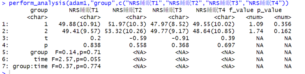
perform_analysis(adam1,"group",c("NRS睡眠T1","NRS睡眠T2","NRS睡眠T3","NRS睡眠T4"))
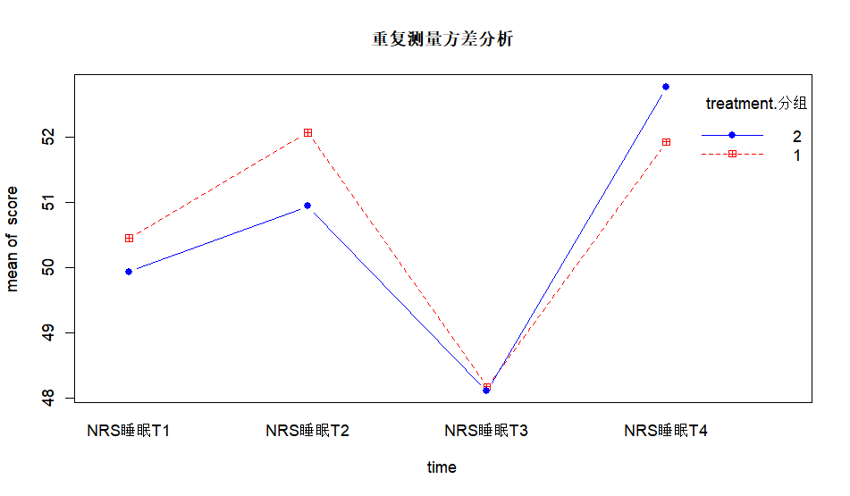
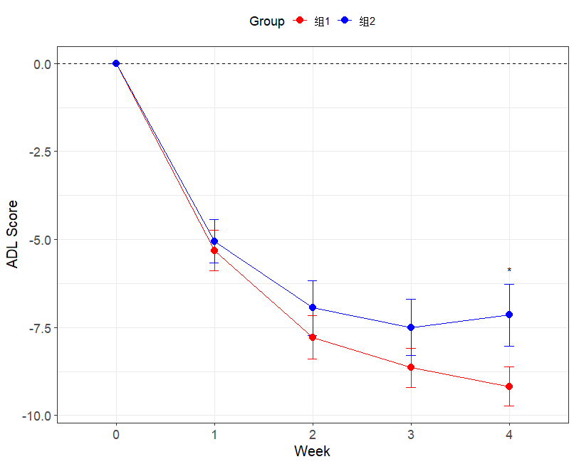
结果图
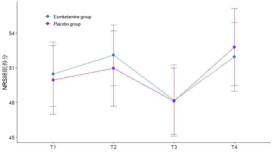
可视化(均值误差图)
library(Rmisc)#生成均值标准误

pivot_adam <- adam1 %>%
  pivot_longer(cols = c("NRS睡眠T1", "NRS睡眠T2", "NRS睡眠T3", "NRS睡眠T4"), names_to = "time", values_to = "score") %>% mutate(id=as.factor(id))

#1 简化版
with(pivot_adam,
     interaction.plot(time, treatment.分组, score, type = "b", col = c("red","blue"),
                      pch = c(12,16), main = "重复测量方差分析"))

#2 ggplot绘制自定义程度高
tgc3 <- summarySE(pivot_adam, measurevar="score", groupvars=c("treatment.分组","time"),na.rm=T)
P3 <- ggplot(tgc3, aes(x = time, y = score, colour = treatment.分组, group = treatment.分组)) +
  geom_errorbar(aes(ymin = score - 1.96*se, ymax = score + 1.96*se), width = 0.1) + # 添加误差区间
  geom_line() +
  geom_point(shape = 16, size = 3) +  # Use shape = 17 for triangles and adjust size
  # annotate(geom="text", x = 5, y = -5.9, label = "*") + #在有差异的时点添加标识符
  theme_bw() +
  labs(
    x = "",                # Set the x-axis label
    y = "NRS睡眠得分",           # Set the y-axis label
    colour = ""           # Set the legend title
  ) +
  scale_x_discrete(
    breaks = c("NRS睡眠T1", "NRS睡眠T2", "NRS睡眠T3", "NRS睡眠T4"),   # Set the custom breaks for the x-axis
    labels = c("T1", "T2", "T3", "T4")          # Custom labels for the ticks
  ) +
  scale_colour_manual(
    values = c("#4682B4", "purple"),  # Define distinct custom colors for groups
    labels = c("Esmketamine group", "Placebo group")            # Set the labels for groups
  ) +
  theme(
    legend.position  = c(0.2, 0.90),   # Position the legend at the top-right corner
    legend.title = element_text(size = 12),  # Adjust legend title font size
    legend.text = element_text(size = 10),   # Adjust legend text size
    axis.title = element_text(size = 14),    # Adjust axis title font size
    axis.text = element_text(size = 12),     # Adjust axis text font size
    plot.title = element_text(size = 16, face = "bold"), # Make the plot title bold (if you add one)
    panel.grid.minor = element_blank(),    # Remove minor grid lines for a cleaner look
    panel.grid.major =element_blank(), # Optional grid styling
    panel.border = element_blank(),  # Remove the border around the plot
    axis.line = element_line(color = "black" )#保留刻度线并设置颜色
  )

P3
生成图形